
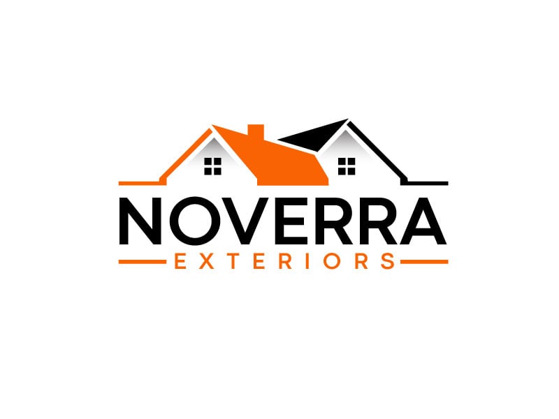
This Noverra Exteriors logo is a solid example of a modern roofing / exterior services logo—clean, professional, and built for real-world use. Here’s exactly what’s working and why.
🏠 1. Clear, Instantly Recognizable Icon
The roofline graphic is simple but effective:
- Two overlapping roof shapes
- One highlighted in orange
- Includes small window details
Why it works:
- Immediately communicates home + roofing
- No thinking required (important for local services)
- The overlap suggests coverage / protection / multiple services
👉 It passes the “1-second test”—you instantly know the business.
🎨 2. Smart Color Strategy (Orange + Black)
- Orange → energy, construction, action
- Black → professionalism, stability
Why it works:
- High contrast = great visibility on trucks, signs, uniforms
- Orange highlights the key part (the roof)
- Feels both modern and trustworthy
👉 This is a very effective combo in home services branding.
🔤 3. Strong, Clean Typography
- “NOVERRA” → bold, uppercase sans-serif
- “EXTERIORS” → lighter, spaced-out secondary text
Why it works:
- Strong hierarchy: brand name first, service second
- Easy to read from a distance
- Feels modern (not outdated contractor style)
👉 The font choice balances authority + approachability.
⚖️ 4. Balanced Composition
- Icon on top
- Brand name centered
- Tagline aligned with horizontal lines
Why it works:
- Symmetrical and stable → builds trust
- Easy to adapt to different formats
- Looks good on both horizontal and stacked layouts
👉 This is important for vehicle wraps, yard signs, and websites.
🧱 5. Minimal but Not Generic
The design avoids:
- Overly detailed houses
- Gradients or shadows
- Complex illustrations
But still includes:
- Slight variation (dual roof shapes)
- A highlight color for identity
👉 This keeps it:
Simple enough to scale, but distinct enough to remember
🚚 6. Built for Real-World Use
This logo is clearly designed for:
- Trucks
- Yard signs
- Business cards
- Social profiles
Why it works:
- Bold shapes → readable at distance
- Limited colors → easy to print
- Clean lines → works in vinyl and embroidery
👉 This is practical design, not just aesthetic design.
🔍 What Could Be Even Better (Quick Critique)
Since you’re thinking like a product/brand builder:
- The roof icon is a bit common (many roofing logos use similar shapes)
- Could be more distinctive with:
- Unique angles
- Subtle negative space
- A signature element
👉 But overall, it’s a very solid, safe, effective design.
💡 Key Takeaways for Roofing Logos
If you’re designing one:
- Use simple roof shapes (don’t overcomplicate)
- Highlight the core service visually
- Choose high-contrast colors (visibility matters)
- Keep typography bold and readable
- Design for trucks first, website second
Final Thoughts
This logo works because it does exactly what a roofing brand needs:
It communicates trust, clarity, and professionalism—instantly.
It’s not flashy.
It’s not overly creative.
But it’s highly functional, and in this industry—that’s what wins.

