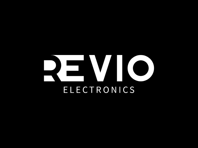
The Revio Electronics logo is a strong example of negative space logo design, where meaning is created not just by what you see—but by what’s intentionally left out.
🧠 What Is Negative Space in Logo Design?
Negative space refers to:
- The empty areas around or داخل shapes
- Used deliberately to form hidden symbols or visual tricks
👉 Great negative space logos reward the viewer:
The more you look, the more you notice.
🔍 Where the Negative Space Happens Here
The clever part of this logo is in the “R”:
- The left side of the “R” is partially removed
- A curved cut creates a hidden shape within the letter
- It subtly forms a forward-moving, dynamic form (almost like motion or a wave)
Why this works:
- Breaks the monotony of standard typography
- Adds uniqueness without adding extra elements
- Keeps the logo clean but interesting
👉 It’s minimal—but not boring.
⚡ 1. Minimalism + Cleverness
At first glance:
- Just a clean sans-serif wordmark
On second look:
- There’s a design twist inside the “R”
Why it works:
- Doesn’t overwhelm the viewer
- Feels intelligent and intentional
- Fits perfectly with a tech/electronics brand
🔤 2. Typography as the Identity
There’s no icon here—the logo is purely type-driven.
Why that’s powerful:
- Easy to scale
- Highly versatile
- Strong brand recall if the typography is distinctive
👉 The modified “R” becomes the brand signature.
⚫ 3. Black & White: Pure Focus
The color choice is simple:
- White text on black background
Why it works:
- Maximizes contrast
- Keeps attention on the form and structure
- Feels premium and modern
👉 Perfect for electronics, where precision and clarity matter.
⚙️ 4. Subtle Motion Cue
The cut in the “R” creates:
- A sense of movement or flow
- Slight asymmetry that draws the eye
👉 This is important for a tech brand—it suggests:
- Innovation
- Forward thinking
- Energy
🧩 5. Hierarchy and Structure
- “REVIO” → bold, dominant
- “ELECTRONICS” → smaller, spaced out
Why it works:
- Clear brand name first
- Industry descriptor second
- Clean, professional layout
✅ When Negative Space Logos Work Best
Ideal for:
- Tech / SaaS / electronics
- Modern startups
- Brands that want to feel smart and refined
Not ideal for:
- Kids brands
- Highly expressive or playful identities
- Situations where clarity must be instant (no thinking required)
💡 Key Takeaways
If you want to design a logo like this:
- Start with simple typography
- Introduce one clever cut or hidden shape
- Don’t overdo it—subtlety is key
- Make sure it still works at small sizes
- Let the idea feel like a discovery
Final Thoughts
The Revio logo shows how powerful restraint can be.
It doesn’t shout.
It doesn’t decorate.
Instead, it quietly says:
“There’s more here than meets the eye.”
And that’s exactly the kind of impression a modern electronics brand should make.