
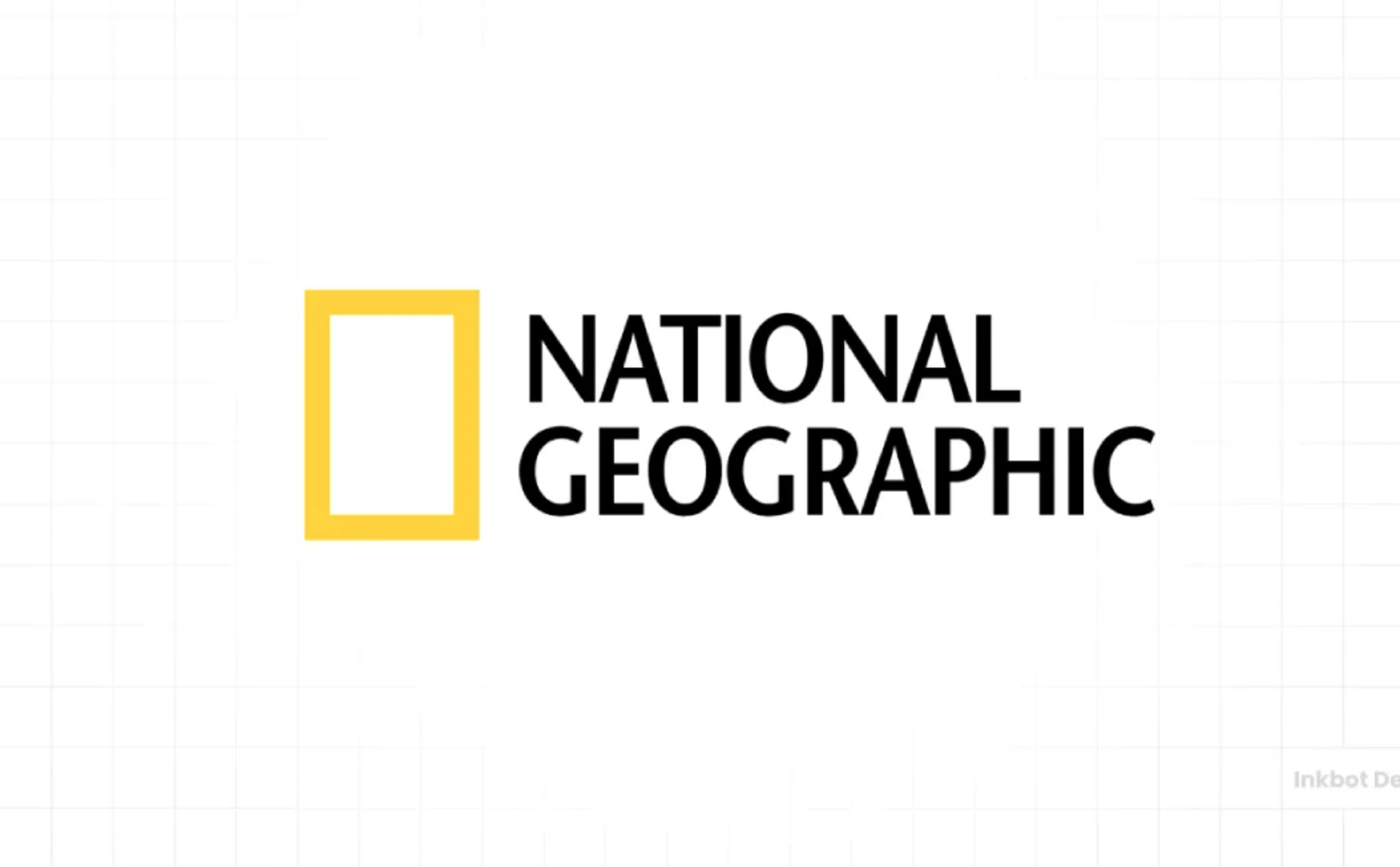
Few logos in the world are as instantly recognizable—and as deceptively simple—as the National Geographic logo. With just a yellow rectangle and clean black typography, it has become a global symbol of exploration, knowledge, and storytelling.
So what makes this logo so effective? Let’s break it down.
1. The Icon: A Frame That Represents the World
At the core of the logo is the iconic yellow rectangular frame.
Why it works:
- Symbol of a window → It represents a view into the world, perfectly aligning with National Geographic’s mission of exploration and discovery
- Framing device → Just like a photograph or documentary shot, it suggests that what you’re about to see is curated and meaningful
- Versatile metaphor → It can represent a screen, a lens, a doorway, or even a map boundary
👉 This is a masterclass in minimal symbolism—one shape, many interpretations.
2. Color Psychology: The Power of Yellow
The choice of yellow is bold and intentional.
Why it works:
- Curiosity & energy → Yellow evokes curiosity, optimism, and intellectual stimulation
- Visibility → It stands out instantly against both light and dark backgrounds
- Ownable color → National Geographic has essentially “claimed” this specific yellow in media branding
👉 Over time, the yellow frame has become a brand asset on its own, even without the text.
3. Typography: Authority Meets Clarity
The wordmark uses a clean, uppercase sans-serif font.
Why it works:
- Editorial authority → Feels like a trusted publication, not a flashy brand
- Timelessness → Avoids trendy fonts, ensuring longevity
- Readability → Clear and legible across print, digital, and broadcast
👉 The typography doesn’t compete with the icon—it supports it.
4. Composition: Perfect Balance and Flexibility
The layout is simple:
- Icon on the left
- Wordmark on the right
Why it works:
- Strong visual hierarchy → Your eye catches the yellow frame first, then reads the name
- Modular usage → The yellow rectangle can stand alone (e.g., on magazine covers, TV intros)
- Consistent alignment → Works across countless formats—from print covers to streaming platforms
👉 This is crucial for a media brand that lives across so many channels.
5. Brand Story Alignment
National Geographic is about:
- Exploration
- Discovery
- Storytelling
- Science and nature
The logo reinforces all of these:
- Frame = storytelling lens
- Yellow = curiosity and illumination
- Minimalism = credibility and focus on content
👉 The logo doesn’t try to depict animals, maps, or cameras—it lets the content carry the story, while the logo acts as a trusted gateway.
6. Timelessness Over Trend
Unlike many modern logos that chase gradients or complex forms, National Geographic has remained remarkably consistent.
Why it works:
- Ages gracefully → Looks as relevant today as it did decades ago
- Instant recognition → No need for redesigns to stay “fresh”
- Brand equity → Consistency builds deep emotional and cultural association
👉 This is the power of restraint in design.
Key Takeaways for Brand Builders
If you’re designing a logo—especially for content, media, or SaaS—there’s a lot to learn here:
- Use simple shapes with strong meaning
- Invest in a distinct, ownable color
- Keep typography clean and timeless
- Design for modularity across platforms
Final Thoughts
The National Geographic logo proves that great design doesn’t need complexity. With just a rectangle and a wordmark, it communicates curiosity, trust, and global perspective.
It’s not just a logo—it’s a window to the world.

