
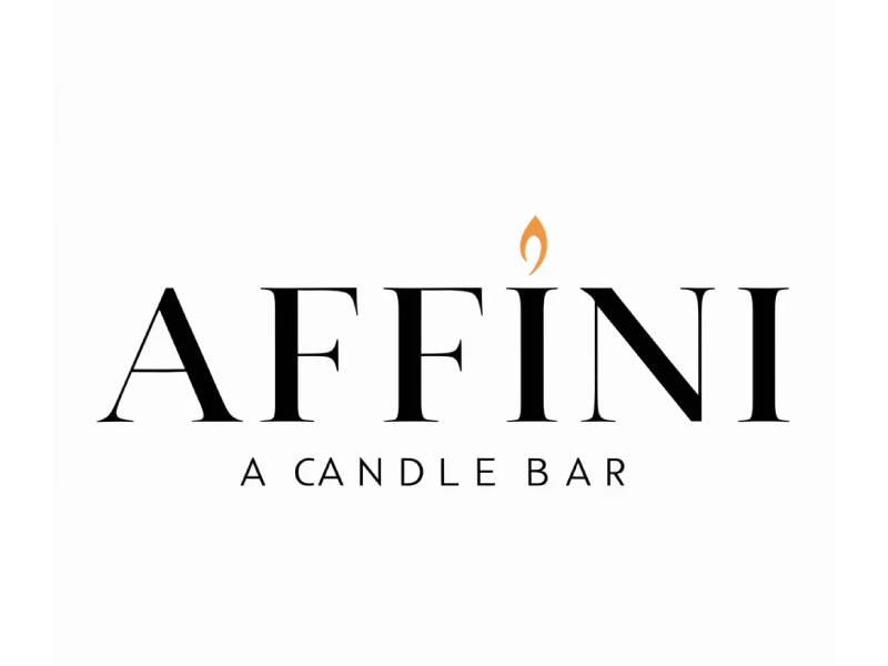
The AFFINI – A Candle Bar logo is a great example of a modern luxury retail logo style, built on three core principles:
Elegant typography + minimalism + subtle symbolism
It’s quiet, refined, and intentionally restrained—which is exactly how luxury branding works.
✨ 1. High-Contrast Serif Typography
The main wordmark uses a thin–thick serif font (similar to Didot/Bodoni style).
Why it works:
- Feels premium and editorial (like fashion magazines)
- High contrast strokes → adds sophistication
- Wide spacing → creates a sense of air and exclusivity
👉 This is the same typographic language used by:
- Fashion brands
- Beauty brands
- Luxury boutiques
🔥 2. Minimal Symbol (The Flame Accent)
The only graphic element is a small flame above the “I”.
Why it works:
- Directly ties to the product (candles)
- Replaces a typical dot → integrates into typography
- Adds personality without clutter
👉 This is a key luxury technique:
Use one small, meaningful detail instead of many elements.
⚫ 3. Black + Subtle Accent Color
- Black typography → timeless, authoritative
- Soft gold/orange flame → warmth and elegance
Why it works:
- Black = luxury, confidence, simplicity
- Warm accent = emotional connection (comfort, ambiance)
👉 Luxury brands rarely use many colors—they rely on restraint.
🧘 4. Minimalism = Premium Feel
Notice what’s not here:
- No gradients
- No shadows
- No complex icons
Why it works:
- Feels clean and confident
- Suggests the product speaks for itself
- Avoids looking “mass market”
👉 In luxury:
Less design = more perceived value
🔤 5. Strong Hierarchy
- AFFINI → large, dominant
- A CANDLE BAR → small, spaced-out descriptor
Why it works:
- Brand name feels like a label or signature
- Tagline adds context without competing
👉 This mirrors high-end packaging design.
🕯️ 6. Emotional Positioning
Everything about this logo communicates:
- Calm
- Warmth
- Sophistication
- Experience (not just product)
👉 It feels like:
A boutique experience, not just a candle shop
When to Use This Style
✅ Perfect for:
- Candle brands
- Beauty / skincare
- Fashion labels
- Boutique retail
- Hospitality (bars, lounges, spas)
❌ Not ideal for:
- Playful or kids brands
- Tech startups (unless luxury positioning)
- Mass-market discount products
💡 Design Takeaways
If you want to design in this style:
- Choose a high-contrast serif font
- Add one subtle, meaningful icon (not more)
- Use limited colors (black + 1 accent)
- Embrace spacing and simplicity
- Think in terms of experience, not just function
Final Thoughts
This logo works because it doesn’t try to impress loudly.
It quietly signals:
“We are refined, intentional, and premium.”
And in luxury branding, that quiet confidence is exactly what makes it powerful.

