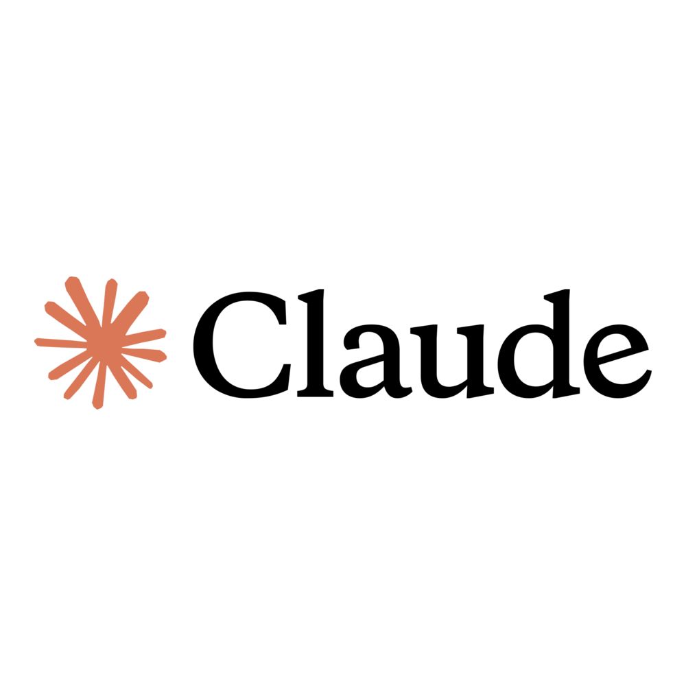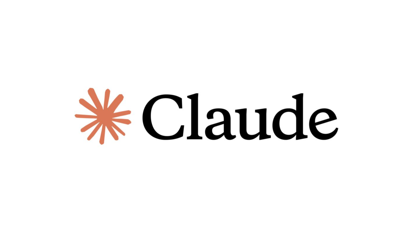
A logo design isn’t just a mark—it’s the silent ambassador of a brand, conveying its personality before a single word is spoken. Claude’s AI logo does exactly that: it draws your eye, invites a closer look, and even brings a subtle smile.
In a sea of tech logos that often start to look alike, this brand logo stands out. It manages to feel approachable, friendly, and a little playful—while still maintaining a sense of professionalism. That’s no small feat.
What Claude Is
Claude is an AI assistant created by Anthropic. Its mission is simple: help people think, create, and communicate better. Safe, reliable, and friendly—that’s the vibe Claude wants. And that vibe needed a logo to match. Every curve, color, and shape has meaning, reflecting the brand’s personality.
Typeface That Feels Trustworthy
Right away, you notice the font: a clean serif typeface. It’s not loud or flashy. It’s confident and calm, giving a sense of reliability—exactly what you want from a tool you plan to depend on. The serif font visually reinforces trust, professionalism, and clarity.
Starburst Symbol: Simple but Meaningful
Next to the type, there’s a distinctive graphic element—a radiating starburst‑like shape. It doesn’t just sit there for decoration:
- It suggests ideas spreading outward.
- It symbolizes energy and creativity.
- It brings a dynamic contrast to the more grounded wordmark.
It’s a small shape, but it adds a surprising amount of personality to an otherwise clean logo.
Warm Orange That Feels Human
Color matters, and Claude’s choice of warm orange is no accident. It’s not the typical cold tech blue.
- Warm orange feels inviting and human.
- It communicates energy without being overwhelming.
- It distinguishes Claude from other AI brands that lean heavily into monochrome or cooler tones.
This warmth reinforces Claude’s brand mission: approachable AI that feels friendly, not intimidating.
What People Are Saying Online
When a logo enters the world, real users don’t always react in design‑book ways. Some of the internet’s reactions to Claude’s logo range from curious to downright funny:
- On social platforms, some people joked that the radial shape reminded them of, well… anatomy, with many memes comparing it to shapes that pop up in humor threads. (reddit.com)
- Others found the shape abstract and unique, noting that it looks less like “standard tech branding” and more like something human‑centric or handmade. (blog.slamdunk.software)
- A few discussions went into deeper territory, wondering if the designers intentionally used such a symbol to provoke conversation or make the logo memorable. (reddit.com)
Funny, critical, playful—even these reactions show the logo gets noticed and sparks discussion, which in itself is a kind of success.
Clean, Flexible, and Everywhere‑Ready
A great logo doesn’t just look good in a mockup. It needs versatility:
- It scales well on tiny app icons.
- It remains recognizable on websites and presentations.
- It doesn’t lose clarity across light and dark backgrounds.
Claude’s logo checks all these boxes. Its simplicity is its strength.
A Logo That Tells a Story
In the end, Claude’s logo isn’t just a symbol. It’s a story in color, shape, and type. It invites curiosity, sparks conversation, and quietly communicates the brand’s personality.
It’s friendly, yet professional. Creative, yet clear. Memorable, yet simple. That’s the kind of logo that doesn’t just sit on a page—it starts a conversation. And in a world full of tech logos that all blend together, that’s exactly what Claude achieves.