
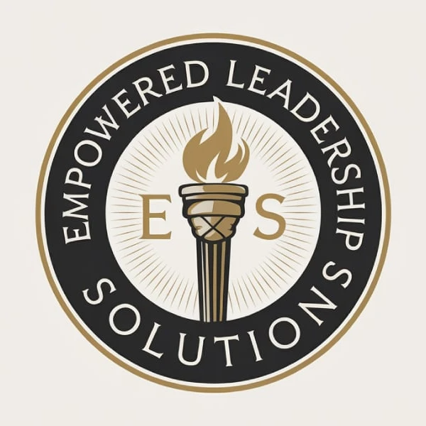
This logo is a classic emblem logo style, often used by institutions, organizations, and premium brands. It combines:
- Circular badge composition
- Symbolic icon (torch)
- Serif-style typography around the ring
- Muted, premium color palette (black + gold)
Key Characteristics of This Style
1. Circular Seal Layout
- Text wraps around the outer ring
- Icon sits in the center
- Often symmetrical and balanced
👉 This creates a stamp-like authority, similar to official seals or certifications.
2. Symbolic Icon (Torch)
- The torch represents:
- Knowledge
- Leadership
- Enlightenment
👉 This reinforces the brand name: Empowered Leadership Solutions.
3. Serif / Formal Typography
- Clean, spaced-out lettering
- Traditional and authoritative
👉 Feels credible, established, and trustworthy.
4. Limited, Premium Color Palette
- Gold → prestige, success, excellence
- Black → authority, sophistication
👉 This combination is widely used for high-end or institutional branding.
5. Radial Details & Line
- Subtle rays behind the torch
- Adds depth and focus
👉 Gives the logo a ceremonial, almost “award-like” feel.
Why This Style Works
This style is designed to communicate:
- Authority → feels official and established
- Trust → resembles certifications and institutions
- Prestige → premium color and structure
- Tradition → rooted in historical design systems
👉 It signals:
“This organization is credible, structured, and important.”
When You Should Use This Style
✅ Best Use Cases
1. Consulting & Professional Services
- Leadership coaching
- Business consulting
- Executive training
2. Institutions & Organizations
- Schools / academies
- Non-profits
- Associations
3. Certifications & Programs
- Accreditation bodies
- Courses and training programs
- Membership organizations
4. Premium / Legacy Brands
- Luxury services
- Heritage brands
❌ When NOT to Use It
1. Modern Tech / SaaS Startups
- Feels too traditional and heavy
- Doesn’t match fast, agile positioning
2. Casual or Youth Brands
- Too formal and serious
3. Mobile-First Products
- Circular seals can lose clarity at small sizes
Design Technique Breakdown
What makes this particular logo strong:
- Perfect symmetry → builds trust subconsciously
- Clear hierarchy → icon center → initials → outer text
- Contrast (gold on black) → enhances readability
- Icon + acronym combo (E L S) → adds memorability
- Consistent spacing → feels polished and intentional
👉 It’s designed like a badge of honor, not just a logo.
Key Takeaways
If you’re designing in this style:
- Use a circular or shield-based structure
- Include a meaningful central symbol
- Keep colors limited and premium
- Focus on symmetry and balance
- Treat it like a seal, not just a logo
Final Thoughts
This emblem style is less about being trendy—and more about being trusted.
It tells your audience:
“We are established. We are credible. We stand for something.”
Use it when your brand needs to project authority, tradition, and leadership, not speed or disruption.

